When I joined Parature in 2013, the product was almost 10 years old by that point. Like a house with lots of additions, adding new features to the product had created inconsistencies over time, and the navigation was convoluted with actions hidden in poor information architecture. A new structure to organize and navigate the site was needed.
Parature
Mega Menu
Optimize common actions and tasks based off feedback to increase user efficiency and satisfaction.
Project Goal
Discovery: 2 weeks
Define: 3 weeks
Design: 1 weeks
Iterate: 1 weeks
Overall: 2 months
TimeFrame
-
Moderated Remote User Research
-
Surveys
-
Design Workshop Exercises (Crazy 8s)
-
Tree Test
-
In-Person Usability Studies
-
Wireframing
Methodologies
The Goal
After ten years of adding feature on top of feature to the Parature product, it was both messy and confusing. Management and users both agreed it was time for a redesign, focused around navigating through the Knowledge Base (KB). The plan was to create a new navigational model for the KB, then bring the ticketing elements into the new structure.
The Challenges
Coming up with a new design for a product that users were accustomed to using is always a daunting task, and I wanted to make sure the new design was usable in addition to more aesthetically pleasing. The information hierarchy needed updating, and the right information had to be surfaced at the right time in the process. Navigation and action bars needed to be consolidated, but without sacrificing the ability to skip around to the desired section, especially since the average user performed multiple roles.
The process
Requirements Gathering
Despite already being generally familiar with our customers from previous projects, I wanted to supplement my understanding with more insight as to how our users were currently using the KB. Through remote user studies, I discovered that smaller organizations allowed any employee to write and publish articles, while larger teams had delineated roles between author and manager roles. I also discovered that since many users would work on articles in between time-sensitive tickets (such as chat or a phone call) they were constantly task switching between the two modes. Knowing the users' needs as well as the technical requirements, I was ready to move forward.
Brainstorming
After creating several different ideas that I wasn't satisfied with, I set up a collaborative design session with a mix of coworkers, including many customer facing roles. In this session, the idea for a "Mega Menu" was born. This Mega Menu would toggle between a simplified collapsed state, and expand to include links for easy transitions between large categories, the ability to see submenu items, and could even accommodate the users' most recently used items to make task switching extremely easy.
Prototypes & Mockups
As I started creating wireframes for how the content would be structured around the new Mega Menu, I also began simplifying the actions on the page. The previous multitude of navigation bars in the existing product were created to accommodate the various actions that could be performed. I grouped the actions into three categories; global actions that did not affect the content on the page, mass actions that could be performed on all elements on the page, and local actions that would only affect a single element on the page.
User Testing
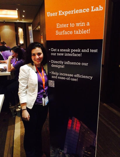
The creation of the new navigational model coincided with the company's annual conference Parafest, which was a perfect opportunity to validate it with real customers. I set up a usability testing booth at the conference and encouraged our customers to participate by allowing a forum for their opinions and the chance to win a tablet. From a study of roughly 15 participants, users voiced their love of the new model and had extremely high task success rates for tasks designed to test the menu. Tree test studies showed the information hierarchy worked well. However, moving the mass actions caused a great deal of confusion and the majority of users had to be prompted to find them. Testing also revealed that if the Mega Menu rendered over the global actions (Quick Create, Search, Notifications, and User Profile) users became confused. Armed with this information, I was ready to iterate on the designs.
LESSONS LEARNED
I always believed that communication is vital to the success of any project, but by talking through the challenges during the design session and having an open mind to suggestions sped up the brainstorming phase. I also learned that while parts of a design might be great, it's always good to test them, because there may be elements that need to be re-thought or do not work in certain contexts.


